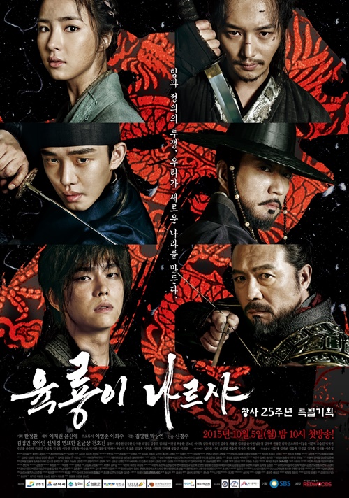
Six Flying Dragons Unfurls Visually Captivating Drama Poster and Main Cast Preview


Now this is what I’m talking about when I ask for an intense drama to live up to it’s visual awareness. More often than not drama productions produce posters that are merely serviceable and do nothing in service of selling an experience that viewers will want to check out. A good drama poster can be such a powerful took in and of itself, getting people talking about the design and from it the expected drama world to come. If a drama promises high intensity, then the poster should capture and convey that energy.
The official drama poster for upcoming SBS sageuk Six Flying Dragons hits the bullseye on both aspects, the black background with the red dragon embossing is a stunning contrast while placing all six dragons together emphatically asserts who the leads are and a glimpse of their character personalities – Yoo Ah In as prince Lee Bang Won, Chun Ho Jin as King Taejo, Kim Myung Min as Jung Do Jeon, Byun Yo Han as Jung Do Jeon’s bodyguard Bang Ji, Shin Se Kyung as Bang Ji’s sister Boon Yi, and Yoon Kyun Sang as the princely bodyguard Moo Hyul.
Third preview for Six Flyng Dragons:
Recent Posts
Chen Zhe Yuan in Talks for Director Guo Jingming’s Next Period C-drama Inferno of Wings
So this feels like a perfect match to me, and one that feels inevitable. Director…
C-actress Zhang Jing Yi Reportedly Cast as Female Lead in High Profile Xianxia C-drama A Beautiful Destiny
So this is the C-drama that last week was rumored to possibly be considering Zhao…
Chen Du Ling and Zhou Yi Ran Cast in Period C-drama Adapted From the Novel Empress Chu
So there was a lot of movement around this drama which has been in prep…
Joo Ji Hoon and Kim Tae Ri Wins Television Category Best Acting Awards at the 2025 Baeksang with When Life Gives You Tangerines Taking Home Best Drama
So this is both a surprise and not a surprise, I think anyone of the…
Married TW- stars Tiffany Ann Hsu and Roy Qiu Confirm They Are Expecting First Baby
Awwwww, what fantastic news to share! Married TW-stars Roy Qiu and Tiffany Ann Hsu announced…
New Stills for jTBC’s Good Boy with Park Bo Gum and Kim So Hyun as Drama Gets Wider Streaming Release
There is a first for everything and it looks like Good Boy is indeed the…

View Comments
The poster is not that good tbh
thank u.it's definately not that good.plus,why does shin se kyung look so unkept??
but i'm still checking it out.especially it being one of my most anticipated drama.
I seriously looked at it for a while trying to see if I'm missing something, but I'm not really getting the intensity. To me the red on black on the poster is striking, but the punch is kind of lost since the really detailed dragon is hard to make out and confusing with everything happening on the front. And the rectangularly cropped individual pictures of the cast piled up makes the composition look kind of lazy and takes away from it. It also kind of irks me that they made an axis splitting the poster in half and then put the title to the side, but that's just me being annoying.
Still, it's just a poster. The trailer looks more encouraging to me.
dang... you said everything perfectly. the poster looks good at first until you study it more and realize everything is too crowded and the rectangular cuts are rather amateur.
I guess this introduction of the drama may rekindle my love for fantasy sageuk. I always love sageuk with a lot of imagination and twists in the storyline, but have been really disappointed at the productions of several dramas in the genre for last 2 years. I hope this one particularly with Yoo Ah Yin in the lead cast will turn out good. It looks promising so far. Don't disappoint me again, K entertainment!
Hmmm, there is a little bit of the music of Rurouni Kenshin in it, and that fight style get it's inspiration from that (awesome) movie too (though we didn't see much of it yet in the previews.
Looks cool.. but posters are just that. The teaser is where it's at!
The trailer looks intense. I can't believe I didn't notice a dragon in the background of the poster until it was pointed out.
Byun Yo Han... Kill me now.
The poster's average though. Nice idea but the implementation is lacking. One look and you feel that something's wrong. And on second look it seems extremely crude.
the poster n teaser seem so average,the story seems quite typical sageuk, not really captivate to me