K-drama Suits Typefont Fail Lends Chortling Results to Official Poster

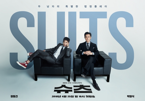


It’s rather apropos to be reminded that praise one day can be criticism the next, everything should be judged on its solo merits. The upcoming KBS drama adaptation of US legal show Suits released an awesomely stylish teaser drama poster two weeks ago that I loved. Sadly two weeks later it’s also the bearer of two bland as heck official drama posters, one of which also provides an unintentionally hilarious subtext read. The horizontal drama poster above has the full title Suits blocked by leads Park Hyung Sik and Jang Dong Gun along with the chairs the guys are sitting on, so much that the type face chosen without ridges on the tops of the I and U makes this drama title read first impress as Sluts. Ahahahaha, OMG I can’t even. Thank you for the laugh to liven up the otherwise dullness.


Recent Posts
Joo Ji Hoon and Kim Tae Ri Wins Television Category Best Acting Awards at the 2025 Baeksang with When Life Gives You Tangerines Taking Home Best Drama
So this is both a surprise and not a surprise, I think anyone of the…
Married TW- stars Tiffany Ann Hsu and Roy Qiu Confirm They Are Expecting First Baby
Awwwww, what fantastic news to share! Married TW-stars Roy Qiu and Tiffany Ann Hsu announced…
New Stills for jTBC’s Good Boy with Park Bo Gum and Kim So Hyun as Drama Gets Wider Streaming Release
There is a first for everything and it looks like Good Boy is indeed the…
Mango TV May Finally Released Republic Era Period C-drama The Love of Hypnosis with Crystal Liu and Jing Bo Ran This Summer of 2025
This may be the longest on the shelf C-drama with now going on 7-years that…
Supernatural Investigative Period C-drama The Demon Hunter’s Romance with Allen Ren and Song Zu Er Ends Run with Decent 7.3 Douban Ratings
iQiyi is surely breathing a sigh of relief with the reception for it's fantasy supernatural…
Zhao Lu Si in Discussions Period C-drama with Zhang Ling He Reportedly Falls Through as its the Same Director as Her Unfinished Drama Almost Lover
Awww bummer I would have LOVED to see these two work together. C-ent casting gossip…
View Comments
Bwwwwaaaashhhhh obviously no one checked the final copy before it went to print and only those of us with an discerning eye and know English would see sluts .....oh great now I can't unsee it! And thanks Koala for the morning laugh! Reminds me of the Chinese lady who wore a sweater to her son's parent teacher interview with the word 'Die' emblazoned on the front unbeknown what it meant and was ridiculed for it. Now she is suing the store owner for causing emotional distress and embarrassment.
Sharp eyes, koala! :)
I thought it said SLUTS too!
I had to take a few looks to figure out the typefont fail before finally getting it. You need to look at the poster from a bit farther distance to catch the word "Sluts" instead of suits. Maybe I was too focused on Hyung Shik to even look at the wordings. Lol.
Those are two handsome "sluts" though. I wouldn't mind. Lol
I had to take a dozen look at the poster before finally figuring out the typefont failure. Well, you need to view the poster a bit farther to catch the word "Sluts" instead of suits. Or may be because I was too focused on pretty Hyung Shik to actually notice it. Anyway, the two are really handsome "sluts". I wouldn't mind. LOL.
honestly... I didn't see it until koala pointed it out. A bit dense.
That what's the first thing I read, "sluts" I was like, wtf! K-dramas are really changing! ????
I still remember shinhwa concert poster proudly write STD for standing (concert) with kim dong wan..bwahaha
But hey that make those posters unforgetable .. Right ?? :)
Ahahahha , and the show unforgettable ! Lol?
Hello! my personal opinion as a graphic designer and i did a lot of posters too, i see nothing wrong with the text behind the actors, and i can read SUITS correctly, even at a first glance. if you see U has a larger gap in between compared to UI, which is nearer coz no space. unless its UI (U I) then that looks like LU. even after i read this post, i still can't see the word. i only see SUITS. btw, the posters look good (at least to me LOL) Thanks!
Agree!
I like the posters...
And only read Suits....very clearly!