Bad Poster, Good Drama
Posters for K-dramas are a notoriously fickle beast. There is no consistency in quality, and if I used posters alone to judge a drama I would miss a boatload of interesting works. Let’s have some fun, shall we? I hereby present to you part I of my trilogy: Posters Which Suck But The Drama Doesn’t. (Btw, I’m not saying these dramas are great, only that said drama is much better than the crappy poster would indicate otherwise).
Giant
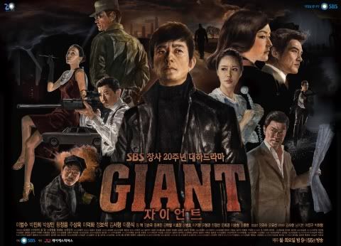
This drama is EPIC, but the poster is dull. Yes, the stylized colors and design is supposed to mimic and invoke an earlier era, but it only invokes the negative associations to that era. I hate this poster, because it actively turns-off a potential drama watcher from checking out this could-be masterpiece.
You’re Beautiful

I dubbed this drama You’re a Greasy Fairy before it even aired because of this poster. If it was meant to be tongue-in-cheek, I think I bit my tongue and gouged my cheek. This is hands down one of the most ridiculously fey posters I’ve ever seen.
City Hall
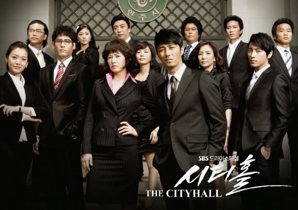
Just a boring, stolid, and dry poster. Pairs well with its name, which is also exceeding dull. But the drama is a romance, ferssakes! A hot, sexy, smoldering romance set within a political fairytale. This poster shows none of what makes City Hallers love this drama, it’s funny and stirring heart.
New Heart
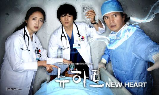
Like every other dull medical drama poster, but somehow they made it even duller. So. Blah. And what’s with the constipated facial expressions? This poster is unimaginative and bland, making this drama fade into the wall with the myriad of its medical brethren. But the drama itself is exciting, well-acted, and well-made.
Wish Upon A Star
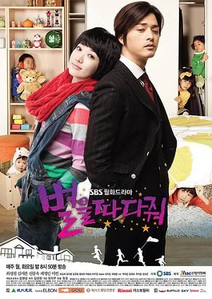
Utterly poor concept. This drama was foremost about the relationship between Pal Gang (Choi Jung Won) and her five siblings, but the kids are relegated to the background while they put the very (non)existent relationship between the OTP front and center. I stayed for the wonderful sibling dynamics, which really fueled how touching this drama turned out to be at times.
Honorable Mention: Tamra the Island

I personally thought this poster was cute and captured the playful and vibrant tone of the drama. But it was after I watched it. I was initially uninterested in this drama after seeing the poster, and have heard numerous misgivings about Tamra because the poster seemed so wacky and lame.
Next up: Good Posters, Bad Drama.

Ok I thought you were talking about us (posters on your blog). Lol. Ok just shoot me. Now. Been looking at spreadsheets for hours so my brain is deep fried.
nycgrl — LOL! Bad poster! Bad poster!
I think the Delightful Girl Choon Hyang poster is pretty awful too, which is why I refused to use it for my review.
ok… I had the same thought as nycgrl and I havent warmed any parts of my brain since last Fri. I thought this will be another hilarious posting on some Santa not-loving posters…
Agreed with how cheesy (read: almost creepy) poster of You’re beautiful! haha..
I also loved New Heart. I don’t mind the poster though.. apart from why is it choppy in the middle bit?
haven’t seen other ones you mentioned. I haven’t really been watching drama lately.
I thought that they could have done so much better with Mary’s poster!!
When I was scrolling through some of the Korean dramas I honestly wasn’t interested in much of them due to the posters…~