When a Man Loves Releases 6 Pretty But Derivative Drama Posters
Good lord have we arrived at a point in K-drama land where someone thinks it not going a good idea to plagerize, its good to do it in mass quantities? Lately I’ve noticed that most dramas have at most 3 official posters for the drama, some even make do with 2 and call it a day. I’ve written about drama posters before, it’s not a make or break element (that would be acting, writing, directing), but a good poster really generates goodwill and great buzz. Let’s call it applying fantastic makeup to an already good outfit. When a Man Loves isn’t just content with a storyline that sounds like a mash-up of every romance melodrama before it (haven’t heard about life threatening illness yet but just you wait), the drama just released 6 (!) different posters, all of which were actually lifted straight from another drama! Like, seriously? Please stop making it so easy to mock you, WAML, because lord it pains me to say harsh words for anything Song Seung Heon does. The first poster above is a kicker – it is the VERY SAME POSE that Yoon Eun Hye and Yoo Seung Ho did in Missing You, not as a drama poster but as a blown up portrait that he hung in the study of his lair of evil. That picture got a lot of publicity because it was so pretty, and they were shockingly exhibiting mature chemistry in it, and because everyone in the drama kept staring at it all the time, as if looking for clues in it. Beyond that, some of the WAML posters were lifted in its entirety from The Equator Man, which is triply hilarious and wrong because the screenwriter wrote that drama! Not to mention to aired to solid ratings last year and is fresh on everyone’s mind. Hello, anyone awake in the booth in there? And then that one poster where all four leads are lined up in boxes next to each other, that one has been in every other drama so I won’t even bother. The only positive is that everyone looks good, but sadly Shin Se Kyung still looks stoned and/or completely detached from the proceedings. The posters are all quite pretty and atmospheric, but its cribbed to such a degree it just makes me unable to appreciate the design because I feel like all originality flew out the window.


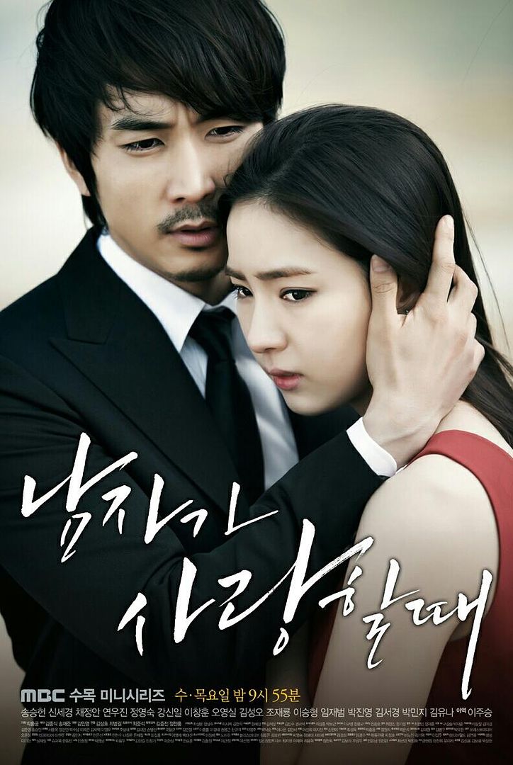
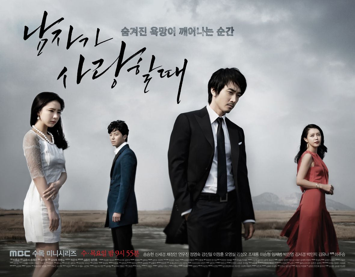

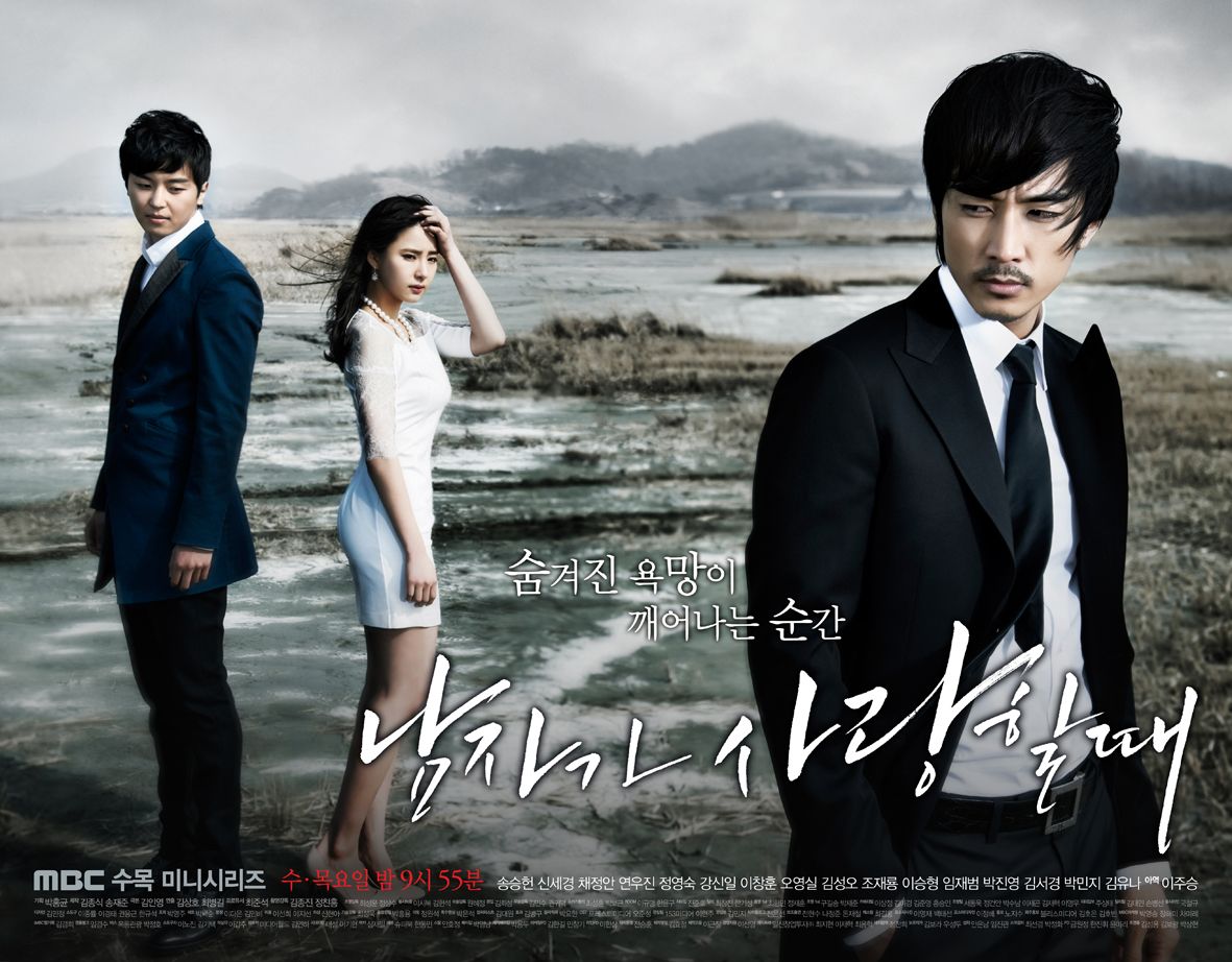

come first! nice posters but SSK has no expression.too bad…
I remember that The Equator Man aired on KBS last year. I think it was King 2 Heart that aired the same time on MBC and Rooftop Prince on SBS.
btw, these posters look boring.
Another title that startled my mind.First I need to get my mind out of the gutter and then I think I need to watch this drama!:)
Shin Se Kyung has the same pose and expression in those stills
My man SSH seriously needs to do away with the mo. It just does not suit him.
when a man looks good he needs so many posters
yummish
meh…
IDK what it is, but SSH looks really strange.
i think it’s the mustache..
Hello!
This, http://stcommunities.straitstimes.com/sites/default/files/imagecache/multimedia_page_thumb/That_Winter3.jpg
and this, http://koreandrama.com/wp-content/uploads/2013/02/That-Winter4-582×327.jpg
I don’t think SSH looks strange…still hot as ever even with the mustache (which I normally would hate)!!! Beside him, there’s nothing really exciting about this drama…hope it proves me wrong.
As for SSK, she only have one expression..BORING!
Fashion king really does seem to get on everyone’s nerves! Maybe its a good thing I haven’t watched any of SSK’s prior dramas because I intend to sit for this one.
Sad the posters look very uncomfortable and awkward.
I almost wish you were recapping this one just so I could read more snarky “When a man…” stuff. LMAO
And SSH – still YUMMY