The Japan-ification of K-drama Posters Manages to Rom-com Everything with an Unhealthy Love of Pink and Hearts
.jpg)
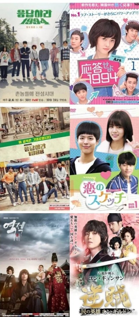
This is such an entertaining side-by-side study and makes me appreciate more that at least K-dramas try to reign in themselves when designing drama posters. Since Winter Sonata twenty years ago hit the shores of Japan and planted itself firmly in the watching oeuvre of the Japanese audience, K-dramas have been exported there regularly and with great success from time-to-time. Since I don’t watch the J-versions I didn’t even bother checking out the ancillary promos until this comparison post came around and I about fell off my chair laughing my head off. J-version posters skew towards pinks and just generally making everything brighter, with a love of rom-com-ing things even when the drama ISN’T a rom-com, i.e. Man to Man or Hello Monster. It turns an amazingly expansive neighborhood slice-of-life like Answer Me 1988 into a love triangle only and Answer Me 1994 is all about the love/friendship lines between four male leads and the female lead. I consider all of these “tweaks” a total travesty and how hard is it to just use the same poster and change all the language to Japanese.
.jpg)
.jpg)
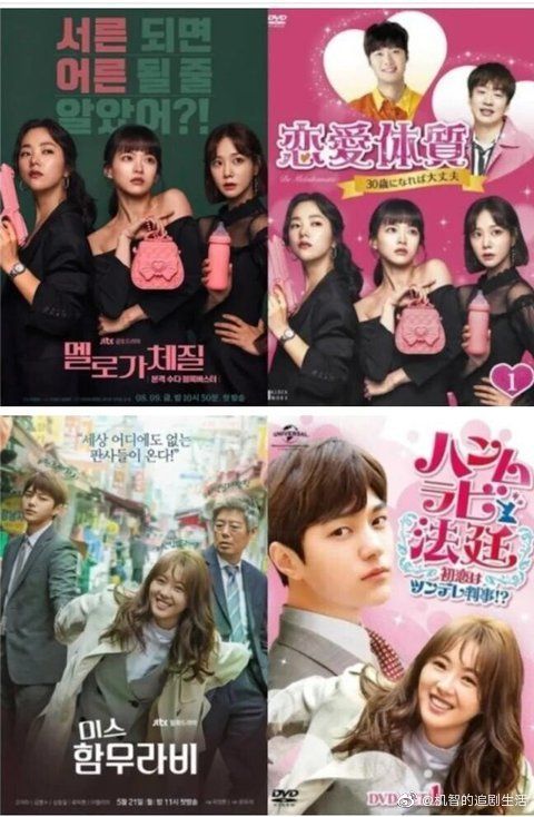
lol pink heart stuff is understandable for romcoms/romance drama posters but they even managed to pinkify the posters for a more serious-toned sageuk like Rebel (at least the poster doesn’t have hearts though!)
I really wish Japanese dramas upgrade themselves now in terms of video quality. If there are already any let me know. Their stories are unique and sometimes better than their korean and chinese counterparts but its the 2010ish camerawork that turns the shows old. Lol these posters look very Japanese though and did they just spoil R88.
I watched this Jdrama Tokyo Alice and it was a romcom but it was actually pretty good and not too cringey.
the one i saw for signal and stranger was hilarious. the cringe.
PWAHAHAHAHA
Okay this is hilarious. I don’t watch Japanese dramas and apparently with good reason. If those posters show their level of creativity (or lack thereof), then I’m clearly missing nothing ?
You are! There are really good Japanese dramas. They can be very weird, but it works or just about normal people.
This is so ignorant that it hurts.
It’s funny because their own dramas don’t have pink poster with a lot of hearts. I don’t know who handles Korean dramas’s rights in Japan, but they have an idea very precise about them. :p
As others have said, these posters are no reflection on J-Dramas, just on the marketing clowns trying to peddle K-Dramas in Japan. J-Dramas have become my firm favourite – so much more intelligent and nuanced than the vast bulk of K-Dramas, and of course, being SO MUCH shorter, they aren’t burdened with soggy pointless bloat that is just there to fill up the overlong runtime. And in contrast to the stupid flowery posters above, many of them are MUCH, MUCH darker than any K-Dramas
+100500
I haven’t dipped into J-drama land in a long while so I’m curious to know if you have any good recs? And where do you usually watch them?
Viki. It is now owned by japanese company.