tvN Sageuk Arthdal Chronicles Releases Laughably Terrible Drama Poster

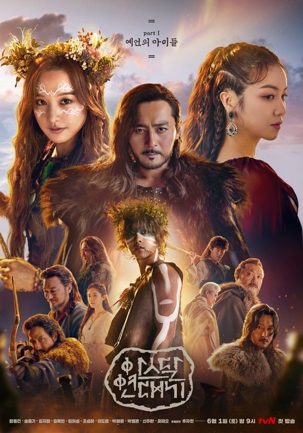
Can I just use the teaser drama poster for now, or at least until the production for tvN sageuk Arthdal Chronicles comes up with a better official drama poster than the one just released. It’s bad, like so so bad. Straight out of photoshop 101 where characters posing individually against a green screen is cropped into an array in the boringest way imaginable. And in this case the positioning makes it even worse, male lead Song Joong Ki ends up not being the center to catch the viewer’s eye, that would be the larger and higher up positioned antagonist second male lead Jang Dong Gun. Worse yet Song Joong Ki looks like he’s emerging in a halo of light from Jang Dong Gun’s chest like some sort of flower child alien crossed with virgin birth hahahaha. Song Joong Ki should have been switched with Jang Dong Gun and placed between the two female leads Kim Ji Won and Kim Ok Bin which may have salvaged this hot mess a bit. Oh wells, I hope all the creativity was channeled into filming.


The first time I see that poster, I cringe. I think I can do editing much better through photoshoot than that lmao
WOW. Laughable indeed! One starts to wonder if this drama is even worth the hype now….
I really have a bad feeling whenever a drama is over promoted and over hyped, as in the case with Arthdal here. It’s like the third rule of kdramaland. But this is helmed by PD Kim Won Suk. I am holding on to the faith that the man won’t screw up this big budget production.
And so glad Jo Seung Ha is here also Reunion with Song Joong Ki…. Oh the innocent man feels…
This might be an unpopular opinion but till now the posters and trailers for this drama have been really bad. The visuals and styling look too modern and this poster is exceptionally bad. This is supposed to be a big budget drama but honestly it has worse posters than a small budget drama like Jugglers. Even trailers don’t give the feel for a good or big budget drama except when they show the landscape and even then some of it feels like bad CGI. I know this is going to sound harsh but it honestly feels like GoT meets Lion King meets Pocahontas. It feels like a mess already.
Seriously nothing about any of the promo material makes it look like some blockbuster budget drama. It looks very bad and your opinion is not unpopular.
@Tai – your opinion is not unpopular, I’m sure a lot of people share it. The stylist and makeup have been remarkably bad, almost to the point of being cartoonish. I’m hoping the plot, directing and acting is better to make up for the lapses in styling and makeup! No pun intended.
Very cartooonish that is what I was thinking. I’m not holding my breath on plot. This drama feels badly researched from what I’ve seen till now from all the videos and pictures.
It reminds me a poster of the movie “a midsummer midnight’s dream ” in the 90’s .
It’s giving me flashbacks to Moon Lovers lol. Remember that?
I just hope the actual drama doesn’t look as cartoonish and cheap as its poster, or is at least the quality we come to expect from Kim Won Seok dramas (seriously who made this poster and were they drunk?)
Honestly ML had better posters than this even upcoming drama Perfume has better posters and teasers. This poster looks some rookie made it with no imagination. The drama isn’t looking good.
Exactly what I thought after watching their interview promo.In that video SJK make-up is really off. I just wanna give it a try as my very first crush from Kdrama land, JDG will appear but the trailer also didn’t give me much excitment.
Possibly the worst poster to ever exist!
Big smile, Koala. Your description made my day. I know I shouldn’t pull for any drama to fail but . . . I bet they’re thinking their timing is golden, after GoT is ended and everybody is hungry for — a lousy imitation??
This drama is going to be meme heaven. Has anyone seen SJK & KJW doing prehistoric ballets turns in the latest trailers? Lets just pretend this is a b-grade GOT parody and laugh our through this wannabe drama. They should have spent that budget for charity or something instead.
Lmao! That so cringey AF! I couldn’t watch it
Wasn’t Arthdal Chronicles under fire and in a controversy for mistreating staff? And it hasn’t even aired yet but will be swept under the rug by thirsty fans and the industry. That money should have gone into the crew’s pockets, but whether this drama is a hit or not we know they’ll only get a bit of that share.
If that is true then I don’t know if I even want to watch the drama. How shitty.
This is going to be hot mess drama the promos were super bad
I have a feeling this is going to be terrible.
X 100
On the bright side we can always hate watch it
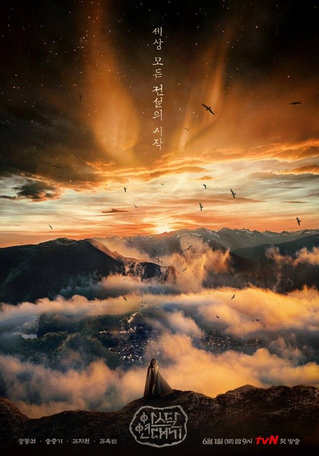
The second picture is a loooot better. Please just use it and add few words on it to make high class poster instead of the first pic. Ugh
The guy on Song Joong Ki’s left (the one holding a pole) looks like he’s cleaning SJK’s ears hua3
This might just be turn out to be the worst drama of 2019
it’s only abt poster. but you are too confident to said like that. lol. i don’t like with the poster too, i was expected more than it. but it trun out be like that. so disappointed. it was felt like when the first time i see ‘Avenger End Game’ poster. it was just so so. and this poster look similar with Avenger’s poster with all hero character with one frame. i dont wanna say, this drama will has good respond like Avenger. bcs i have not watch it yet. but sorry to say, it’s only poster but you already said like you have watch the first episode of Arthdal
C-drama Tribes and Empires was a complete failure in the writing department, however, they got the costume design right. The producers of Arthdal should have taken that drama as an example. Look how clean and neat everyone appears to be, it’s as if they were afraid the actors wouldn’t seem beautiful enough. At least they dropped the skin whitening I guess, but still, that doesn’t cut it for me.
I remember how excited I was with the Tribes and Empires trailers. I’ve learned to hold off on the c-dramas until the reviews come in and never actually watched it. I can live with crap posters if the writing is solid, but I’ve learned to be very leery of big production k-dramas. Something usually goes wrong.
I don’t think it looks that bad though??? I’m not too updated with this drama so I’m not really sure what the goal of the poster is to be except give off a magical almost comical vibe. It reminds me of the poster for the Chinese movie ‘Journey to the West’. I’m not sure if it’s just me watching a LOT of Chinese fantasy dramas or wuxias lately but I feel they’re trying to tap into the whole fantasy action genre that’s on the rise lately in Chinese dramas.
I think there you defined the issue. This isn’t fantasy neither comical. It is supposed to be a historical drama. I am not sure if it’s entirely based on reality or not but as much as I know, this isn’t a fictional fantasy world that they are portraying.
What’s with the negativity? I actually kind expecting the writing will be make me dissapoint. But at least I can still trust PD Kim Won Suk yo deliver.. So far in his three previous work, the directing are solid. Even with not uneven cast like in Misaeng. With this reliable cast, the only thing that will be make this gone wrong is if the writing is falling apart.
I don’t know what you are talking about but the writing won’t be the only problem with the drama if it happens to be bad. The visuals and aesthetics of this drama is already falling apart. Every PD can have one bad drama this looks like its gonna be his one failing. The visuals are bad and not just mildly bad but completely horrible.
I won’t expecting high quality blockbuster aesthetic like western series. They have the budget and they can afford the over the top action and CGI. But I will expecting a reliable acting from the cast and reliable directing. The costume thing is not too bad. It feels modern but still far from ruining a production value. I might be eating my words, but as of now i competely trust them based on their previous work.
Flintstones with CGI ??
For me it is about the writing. If we go by the poster, the production is making everything pretty instead of a more realistic gritty –something like Chuno comes to mind as doing a good job of blending the two. But a poster is just a poster. We’ll see soon enough.
kim jiwon teaser looks so weird too.
The main poster looks like from avengers infinity war..
Somebody decided to copy paste the idea with a downgrade. This poster looks cheap and uninspired so do all the trailers.
Is this drama set in the stone age?
The same era as GoT lols…
What the…????
Well I like LSG and JDG looks really hot and I have a feeling that this may just be unintentionally funny so there may be some value in watching it.
Of course the best thing would be a decent drama but based on the poster I’m not holding my breath.
Unfortunate drop in quality from previous posters. But I liked what I saw from the new trailers. Will watch and decide later what this drama is. C’mon June.
Looks like an Avenger poster with all the superheroes in one but with the costume looking like games of throne theme instead ?
Nothing wrong the poster. What’s with all this negativity
Hahahahaha six flying dragon writers losing touch and terrible copying chinese historical drama. Another flop to song joong ki after battleship island. He need Kim Eun sook drama to boost his popularity.
It’s a pity you guys judged the drama because of a poster. I am thrilled to be watching one of the most uniquely fascinating shows in all of Korea. The writing in it is ingenious! True work of art. There has never been a show so mind blowing and captivating. Y’all are missing out on an awesome show. I actually enjoy reading koala’s recaps because she usually picks the best Kdramas and since Arthdal Chronicles has become one of the best shows to watch , i came looking for recaps here. It was such a disappointment to come across such a subjective and highly critical post. I actually feel bad for y’all because you are missing out on a great storyline. It keeps you guessing and wanting more. Like solving a puzzle, very unpredictable too. Now That’s a great show !