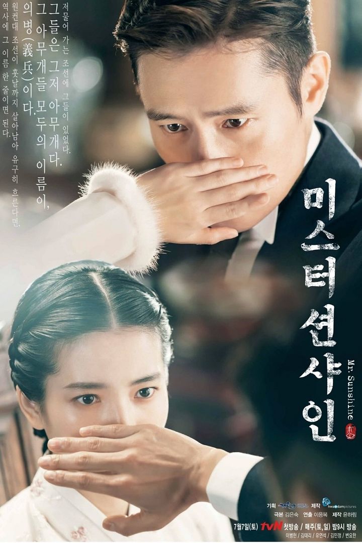
Mr. Sunshine Releases First Hand-to-face Drama Poster Featuring Lee Byung Hun and Kim Tae Ri

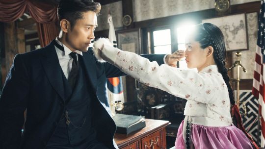
It’s a rare miss for poster making of a Kim Eun Sook penned high profile drama. Upcoming tvN period drama Mr. Sunshine released the first official poster today and it’s just awful. Featuring leads Lee Byung Hun and Kim Tae Ri, the poster captures the two placing a hand over the other person’s lower face clearly to ascertain their identity as perhaps the masked person each has seen before. This looks like a fan poster if you ask me and not a particularly well made one in terms of design and aesthetic. It also makes Lee Byung Hun look menacing the way he appears to loom over the tiny and super young looking in costume Kim Tae Ri, not the way to build confidence this December-May onscreen romance can sell itself convincingly.


This will probably sound bad but I feel a lost daughter, father trying to find her type of feel lol not romance at all. *_*
If you didn’t know the premise of this drama and on face value you would think it was a father/ daughter relationship. KTR looks like a pretty 12 year old girl against LBH. And yes I know she is playing a character and is his love interest. Looks weird!
They should have cast an actress who look like her age or at least who can act like one. But we still do not know how old Kim Tae Ri’s character in the drama.
Or they should have cast an actor who can act young. Whilst KTR facial expressions has of the young girls, LBHs grumpy looking face makes him look mature for KTR.
Little girl says to Daddy “smell my hand, its stinky”. Daddy says “smell mine, it’s stinky too”. Yucks! ?
??
Terrible poster. It highlights the father and daughter feel even more.
They should have got Yoo Yeon Seok as well in the poster but made each of them do one of the following: One cups their hands over their eyes; the other over their ears and the last one over their mouth. What a great feat in story; cinematography; costumes; set design only to be marred by this stupid dumb poster! Like how thick can you get in allowing a concept to take shape only to make it backfire with a simple gesture between the leads who are supposed to be our OTP and now they’re going to be on memes. I blame the creative team for this silly mistake. Oh well hope the OST is great! ?
Anyone wants to bet this will become an iconic scene that’ll get a million parodies?
But KTR and LBH ia a high profile actors, so don’t worry guys 🙂