Joseon Gunman Releases Additional Breathtaking Stills as Three Musketeers Continues to Underwhelm on Visual Design
Visuals are part of a drama’s whole package even if it’s doesn’t play a deciding factor like writing or acting. But bad cinematography, chintzy design, unattractive make up or costuming choices, all of that adds or detracts from the overall appeal. Much like pretty people often get an undeserved boost over the same criteria but less attractive competition, a pretty drama with gorgeous visuals never hurts the bottom line of how the audience receives it. It’s the Summer of sageuks again with Joseon Gunman already airing, Records of a Night Watchman starting next Monday, and Three Musketeers premiering in three weeks. None of them compete with each other in the same time slot and have very different story lines and appeals but when it comes down to visuals there is a huge gap that’s jarring. I’ve already said my piece about how terribly low budget Night Watchman looks from most of the stills and posters which at this point is all done being released and it’s time to wait for the actual show to drop.
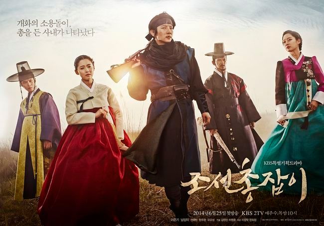
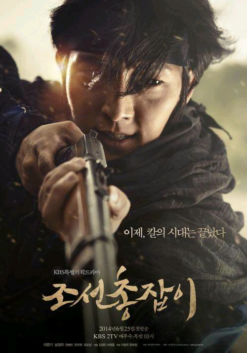
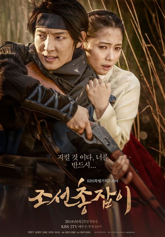
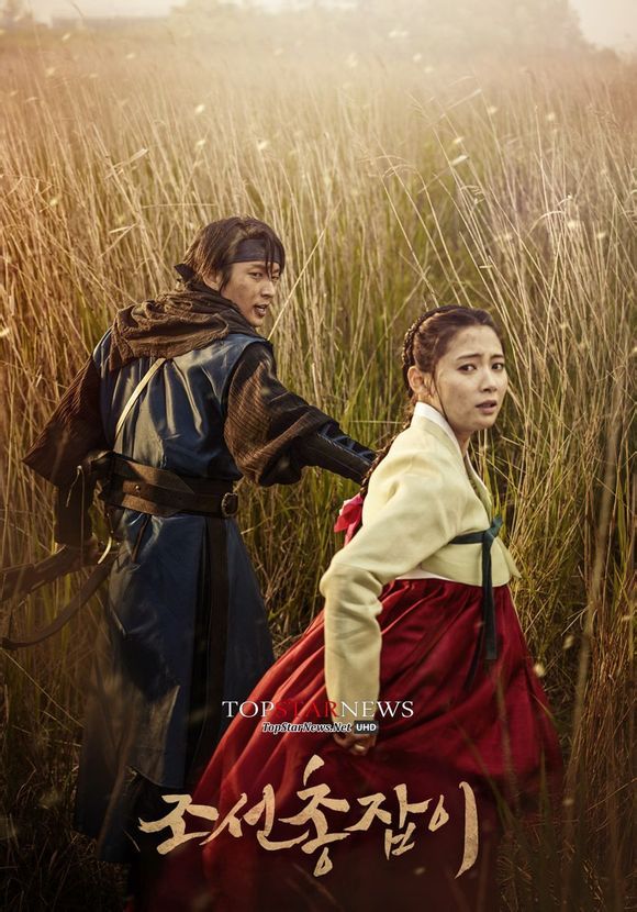
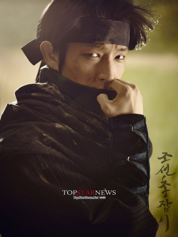
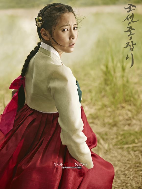
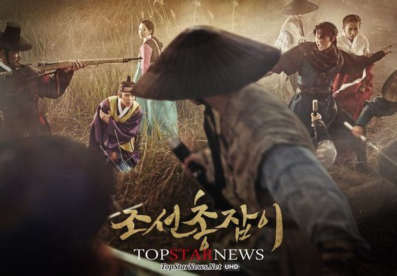
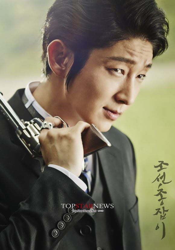
This week Joseon Gunman released a secondary batch of official character stills despite being halfway done already, a smart way to keep the interest high for the second half. These stills are so beautiful its unreal, with the main cast photographed in a field individually and together without any photoshopped stiffness. The touch ups in lighting are rendered seamlessly as to enhance the images without making it look fake. This contrasts starkly with the production of Three Musketeers releasing a batch of group and individual cast stills on its official website that are frankly an embarrassment to be shown. It’s such an insult to the cast and crew for whoever is the graphic designer on this team to present such lifeless and poorly photoshopped images as promotional material. PD Kim Byung Soo has a flair for stylish directing having done Nine: Nine Times Travel, Queen In Hyun’s Man, and Vampire Prosecutor, but all those dramas had gorgeous promotional visuals as well to complement the actual drama being so lovely. So far the TM promo stills are a lesson in what not to do.
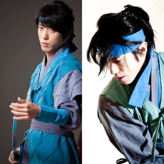
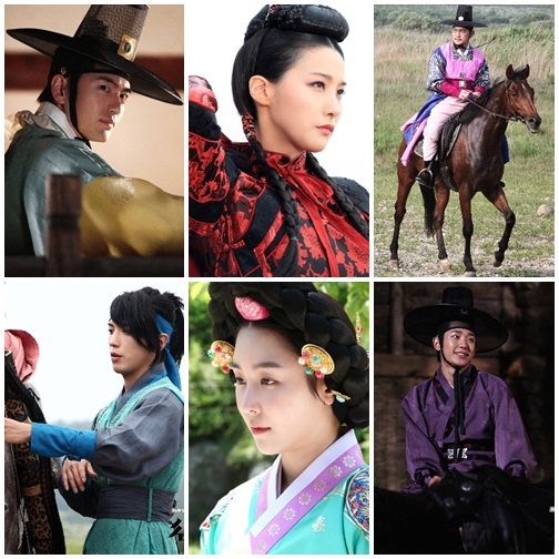
I wish Three Musketeers would step up to the plate and do justice to the intriguing cast of Lee Jin Wook, Jung Yong Hwa, Yang Dong Geun, Jung Hae In, Seo Hyun Jin, and Yoo In Young. Here’s hoping TM is saving the best for last. Even if the drama turns out awesome then when folks want to write about it, a quick Google image search will turn up these horrid stills above. Such a first relay runner dragging down the team situation and needing the final three batons to work extra hard. Check out the JG stills below on how to do visual promos beautifully right.
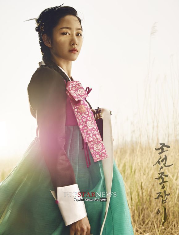
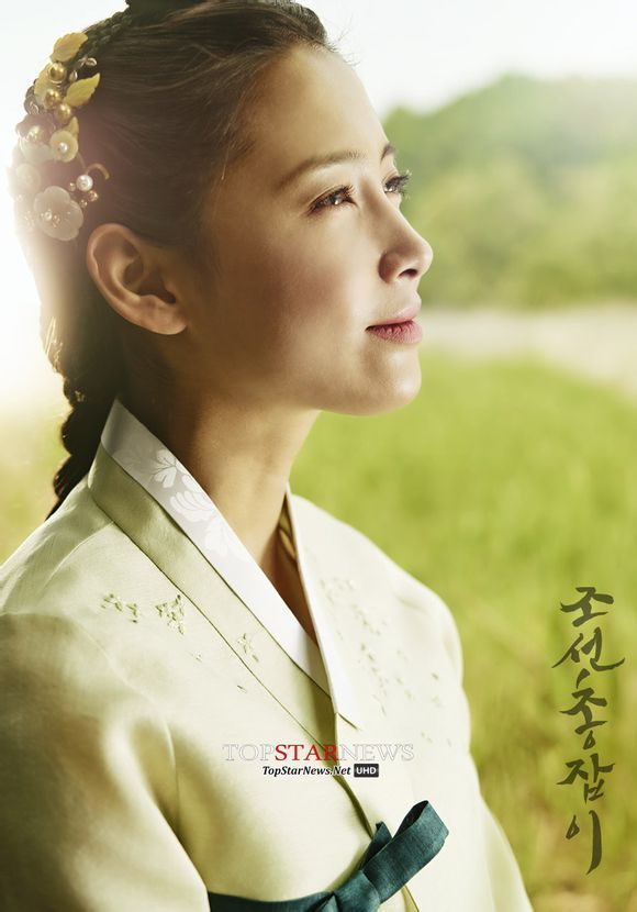

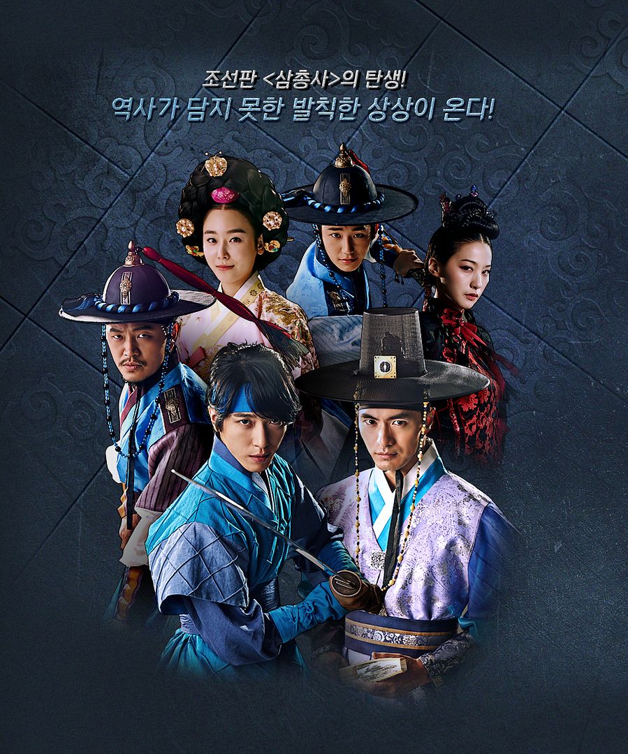
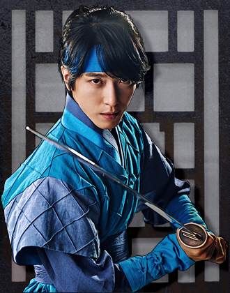

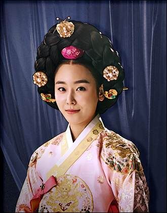
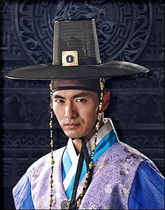
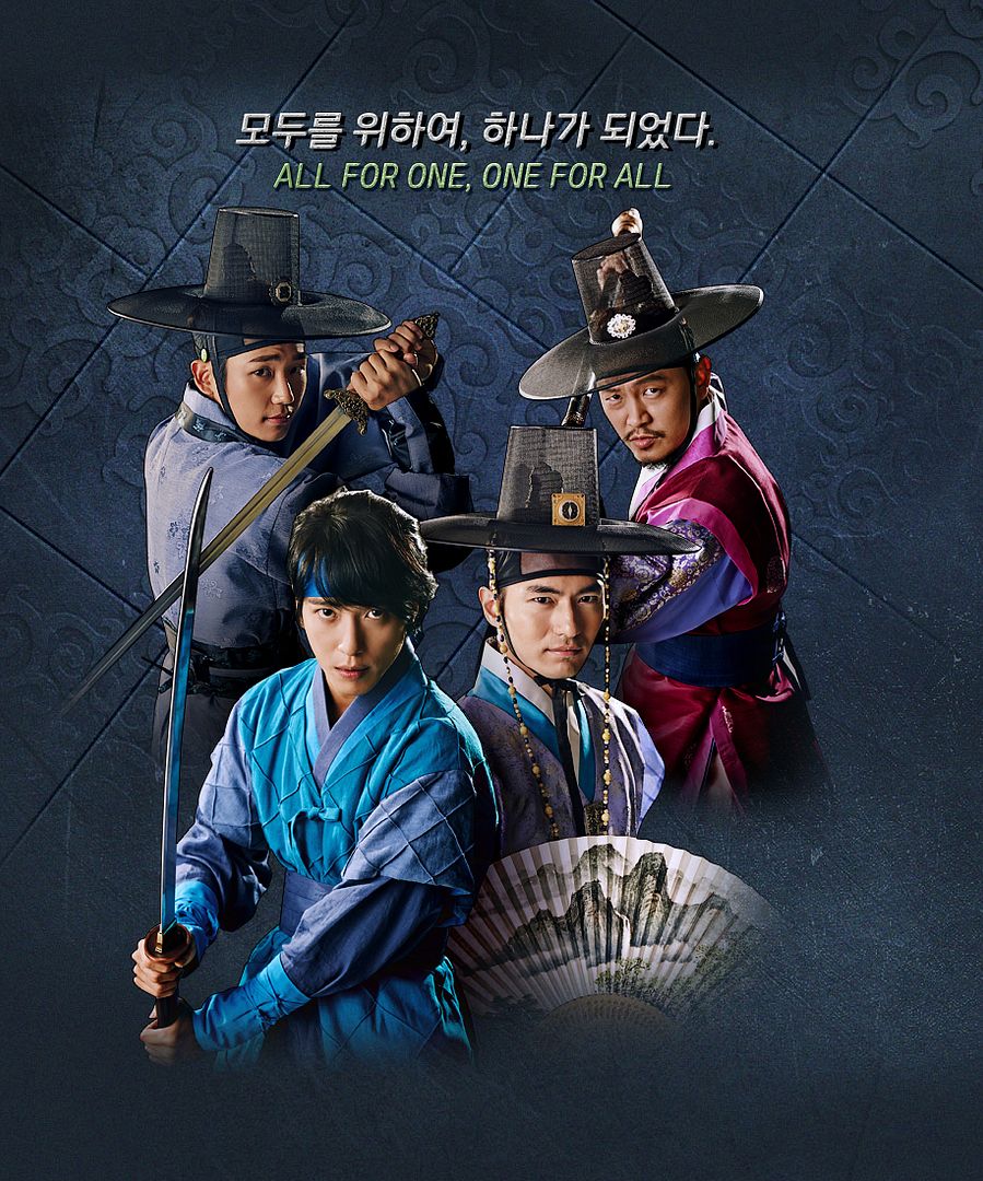
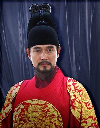
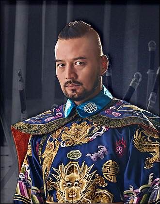
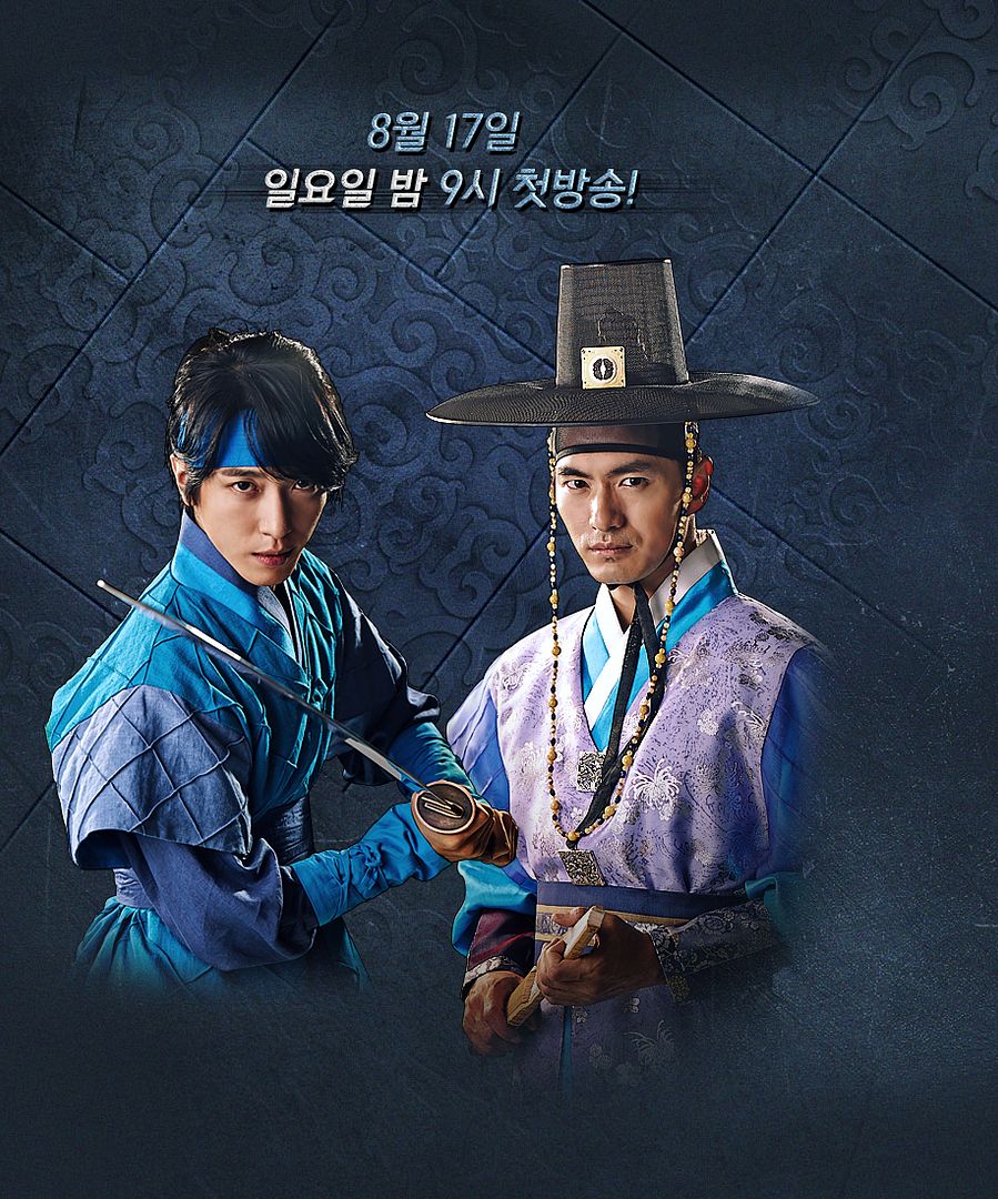
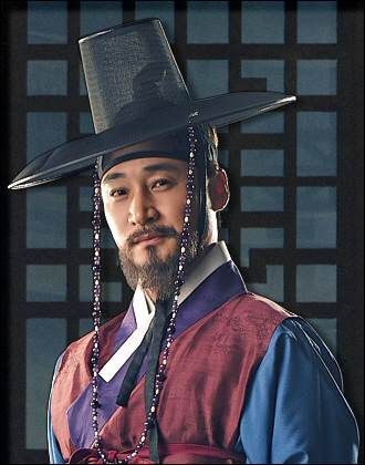
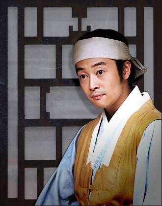
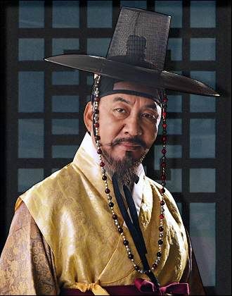
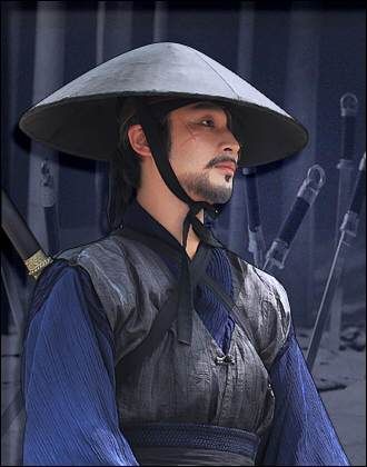


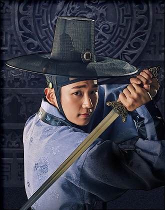

3 Musketeer team has fallen in love with the fake 3D effect.The worst thing is, that must take an awful amount of time to cut all those silhouettes… Worst pic is the one with the blue curtain in the background. Almost sure I could do better.
It really got the look as if they’d let the intern do the job. :/ Plain awful.
JG on the other hand is breathtakingly beautiful. The pictures tell a story of their own. One is immediately curious what’s going on. TM makes me think of posters for Madame Tussauds.
For someone with experience, it doesn’t take long to cut out silhouettes. It’s thrown together rather haphazardly.
Joseon Gunman’so posters are simply gorgeous ♡
JG posters are awsome one hell of a good? Job I loooooove lee jun gi I hope this is not underrated like two weeks which was awsome tooo
Some of those TM stills look like they just cropped a face into a costume. Ugh.
Really, TM?
They took a picture of a tiled floor or ceiing and someone said “Midnight blue tiles! Yes. It totally has that swashbuckling feel we need.”
As far as JG. Hot damn. The one with LJK half covering his face…be still my heart. But I also love the paul-newman-steve-mcqueen-robert-redford smirk on Hanjo the Gunman’s face. It is interesting to see what different levels of skill can do with the same tools.
When you said TM stills were bad I had no idea what I was scrolling in to…just terrible
Joseon Gunman stills are so emotional and I could peaks my interest just by looking at them. I think credits goes to the photographer as well.
“Wow, this is awful!” – Teddy
I could have done a better job than these. Just what’s up with the background? It looks like one of those old Windows 95 desktop background.
And I don’t know what exactly kind of 3D effect they’re trying to do, but there seems to be no blending of layers happening in here at all. It’s like literally cropping an image and placing it on top of another.
Uninspired and hideous posters.
The JG posters though, wow, couple it with the epic orchestra OST and I can already imagine the scenery and intensity of it. Goosebumps worthy.
The problem with TM’s posters besides the bad photoshopping, is that the actors and actresses look like they are just posing for the camera as if they are in a photo studio. The JG’s posters look like the camera caught the actors and actresses unaware in full action and emotional mode. So what we have are stiff studio photos in TM vs natural and expressive action shots with great facial acting and body language in JG.